When thinking about art of the past (and art of today), it is always worth keeping in mind that no artist lived or worked in complete isolation. Ideas were exchanged - and still are - between contemporaries and by borrowing from or being influenced by older generations of artists.
Sometimes an artist, like Raphael, used drawing as a means to develop an idea that would result in a painting - you will have seen this if you have already looked at the resource for Raphael’s Study for the Transfiguration. Drawing might also be a means of annotating the visual experience of looking at another artist’s work. That might be what was going on when Raphael made this drawing.
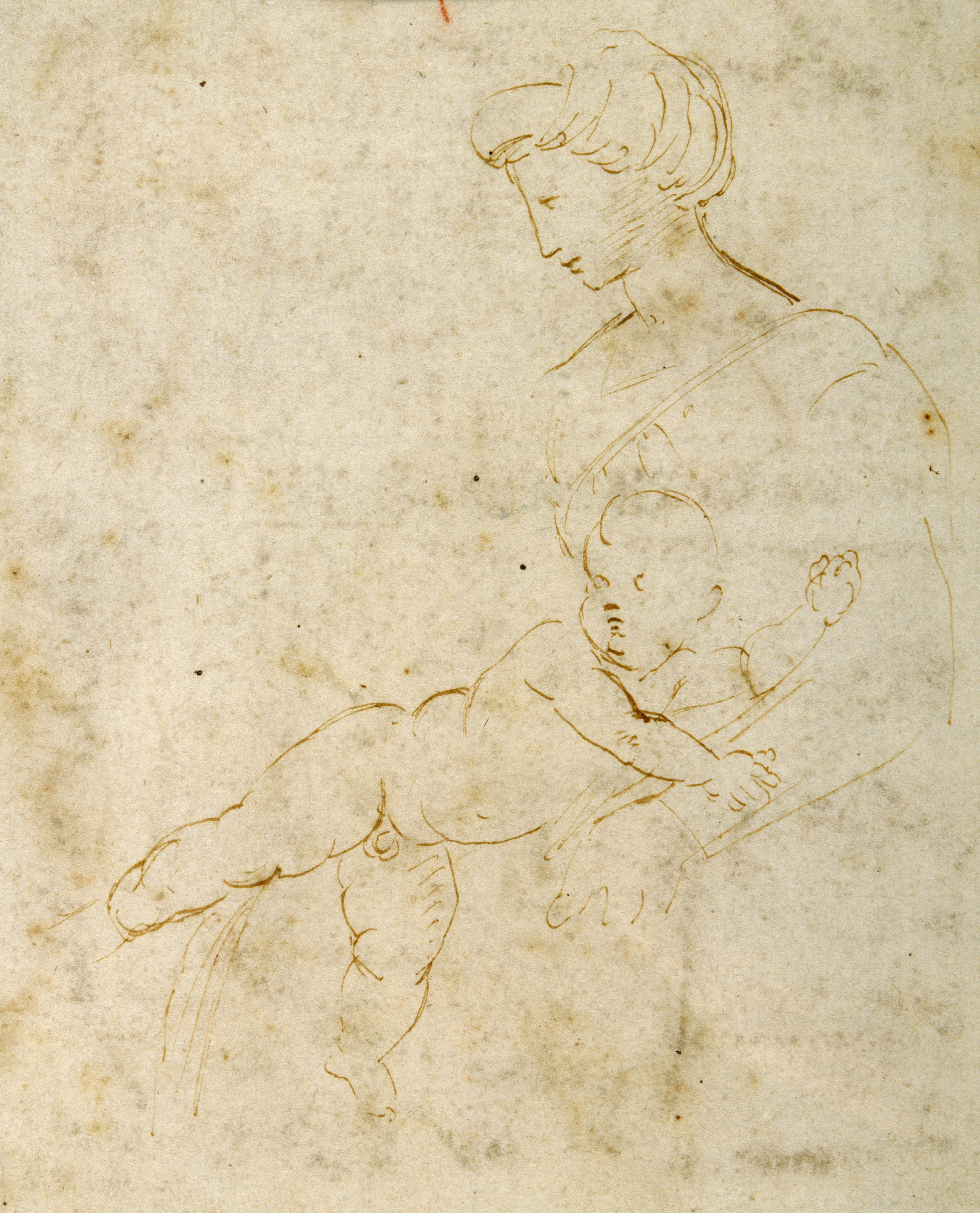
Take a moment to enjoy these details. Start with the woman’s head.
Think about the following statements as you spend time with this and decide whether you agree:
- Raphael has been very economical with his mark-making to create this head
- There is a sense of sharp precision to Raphael’s use of line
- Many of the lines that make up this face do not connect to any of the surrounding lines - they stand alone (few overlaps or lines merging with other lines). Yet, seen as a whole they suggest the sharp profile of a face and the softer, voluminous suggestion of fabric covering hair.

Now look at this detail of the child’s head, shoulders and arms.
Re-consider those three statements put to you when looking at the woman’s head:
- Economy of mark-making
- Sense of sharp precision
- Lines standing alone

Make a note of where you can detect similarities in Raphael’s approach to mark-making, sharp outline and stand-alone lines. Also observe where there are stark contrasts.
Taking time to look from one face to the other, discarding all other detail for now, can illuminate Raphael’s thought and creative process.
Imagine taking a photograph of a woman seated with an alert and curious baby on her lap. The adult subject can sit still long enough for you to capture her with ease. The baby, on the other hand, has not yet developed an understanding or willingness to play along with what you need for your perfect shot!
The blunt pen outline of the woman’s face in profile is confident and has a statuesque appearance. The parallel hatching from the midline to the jawline of the side of her face supports this still, almost sculptural quality.
The shorter, curved lines suggesting the shape and features of the child’s face, the smudged suggestion of a snub-nose and the wriggly squiggles rendering elbows and hands all capture the movement and behaviour of a small child on paper and in real life.
Despite the very different effects achieved through the handling of the pen to create contrasting lines, both create a shorthand that is legible to us as representative of the human face and body.
Now look at the bodies.

The woman’s arm, shoulder and neckline get the most cursory of linear representation here. The details below her neck are light and sketchy and almost appear as if their sole purpose is to serve as a frame for the infant stretched out across where we imagine her lap to be.
The shorter, curved lines of the infant’s head carry through the rest of his body, rolling down his chubby back, waist and extended thigh and calf of his right leg, which stretches straight out behind him. Follow the line of this leg back up through the body and it naturally extends along the left arm. In spite of the visual liveliness, there is a strong centre of gravity through the axis running the length of this pose.
The pose is a good example of contrapposto, which perhaps would be more evident if the child was standing up. The torso turns to the right whereas the bottom half turns to the left. Contrapposto is easier to detect in a standing figure where the body weight appears planted firmly on one leg, usually resulting in a slight tilt to the hips and shoulders. The overall effect is either that of animation or a pose that comes across more relaxed than a rigid, frontal, straight-legged pose.

One fantastic example of contrapposto in a sculpted standing figure is Michelangelo’s David. This sculpture dates to a period when Michelangelo was working in Florence. It took him more than two years to complete the enormous sculpture, which was unveiled to the Florentine public in 1504.
Around this time, the young Raphael was also working in Florence. There is a pen and brown ink study inspired by Michelangelo’s David by Raphael in the British Museum’s collection. His study of Michelangelo’s sculpted masterpiece dates to the same time as the drawing we have been looking at in detail here.
Raphael was in his early 20s, absorbing many artistic sources in Florence. Shortly after the date of this drawing (1505-06), he travelled to Rome to work in the Vatican on a commission to decorate some rooms in the Vatican Palace for Pope Julius II.
Raphael was working on his wall frescoes in the suite of rooms near the Sistine Chapel while Michelangelo was working on that Chapel’s painted ceiling. It is to these years, spent working under the roof of the Vatican, that the infamous rivalry between the two artists is most heavily connected. Raphael’s style was much appreciated in his own lifetime and was summed up by Giorgio Vasari, the 16th century Florentine painter and author who wrote many biographies of fellow artists as,
Pleasing in colour, beautiful in invention, and charming in the expressions, with design in keeping with the rest.[1]
He might have somewhat stolen the limelight from Michelangelo - and caused some upset. However, he does appear to have openly acknowledged his indebtedness to the older artist.
Look again at this study. The pose of the child, which we have considered in detail, is so similar to that of the sculpted child in Michelangelo’s Taddei Tondo, that it seems highly likely there is a connection.

Image right: Michelangelo Buonarroti, Tondo Taddei, marble. Credit Royal Academy of Arts, London, UK/Bridgeman Images
Raphael has stayed true to the sculpted version of the Virgin Mary. The headband, veil, profile, neckline and arm position share a strong likeness to that of the Michelangelo.
In Raphael’s drawing, the child actively turns outwards from his mother, whereas in Michelangelo’s sculpture, the child presses into his mother with his left arm. The angle of his head and the tension in his right shoulder further accentuate this. In Michelangelo’s sculpture, the child might be recoiling from the object held out towards him by the other infant - it’s hard to make out but it might be a Goldfinch, which is symbolically connected to the passion of Christ.
One major distinction between Michelangelo’s sculpture and Raphael’s drawing is the inclusion in the sculpture of a third figure, the infant John the Baptist. This might, in part, explain Raphael’s decision to change the child’s pose and show us how he has borrowed an idea and developed it into his own design.
The pose of Michelangelo’s child looks a little uncomfortable whereas Raphael’s has a gentler internal rhythm created by the balanced contrapposto.
Time spent taking in the details of one drawing can be rewarding in itself. It can also help us appreciate the way a subtle change to the position of a head and arm can lend another work of art a different interpretation altogether.
A-level specification
Raphael is a named artists on the Art in Renaissance Italy 1420-1520 topic.
[1] Vasari 1550/1568 (1967-87), vol. 5, p.88