Take your time and look carefully at this drawing.
Concentrate on the colour range and write down which colours the artist Rubens has used for different aspects of this study of two Franciscan Friars.
Take a look at the Rembrandt drawing in this resource alongside this Rubens’ study.

Image left: Rembrandt van Rijn, The actor Willem Ruyters in his dressing room, pen and brown ink on paper
Rubens was a little bit older than Rembrandt. They were both working in the European lowlands (present day Belgium and Holland). There is no evidence that they met in person and the contexts within which they worked were very different; Rembrandt was based in the predominantly protestant Dutch republic while Rubens worked mainly for Catholic patrons.
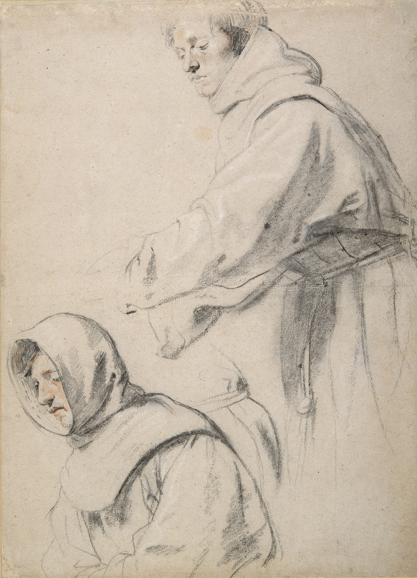
Two Franciscan Friars is a study for an altarpiece showing the last communion of St Francis of Assisi, painted by Rubens for a church in Antwerp. The figures in the study are recognisable in the final painting although their spatial relationship to one another has changed.
Can you work out which figures in the final painting feature in the drawing?

Image left: Sir Peter Paul Rubens, The Last Communion of St Francis of Assisi, oil on panel, credit Koninklijk Museum voor Schone Kunsten, Antwerp, BelgiumDeAgostini Picture Library/Bridgeman Images
Take a close look at the detail of this friar’s face.
Rubens has used mainly black chalk. Note the way in which he has applied it. There is a broad and expansive application for hair and the demarcation between jawline and the hood of the friar’s habit. Rubens has criss-cross hatched in black and red chalk with some very delicate white highlights across the friar’s cheek. This indicates the hollow curve in from the cheek to the side of the nose.
What effect does this have?

Now look at the habit worn by this friar.
This is also drawn in black chalk. Note how it is applied to the paper.
Have you ever used chalk?
If you have, you might have experimented with using the sharp edge and the long side of the chalk, creating different effects. It looks like Rubens has done this here. Cast your eyes slowly across this detail identifying the different ways in which he has held and applied his material.

It is tempting to imagine where he may have rubbed the chalk with his fingers to smudge and blend the creases and folds of the full sleeves and where the habit tapers towards the friar’s rope belt.
Chalk is a very satisfying material to work with. You might want to try using some as you discover more about the ways in which artists like Rubens, Raphael and Leonardo manipulated it to different effect.
Now look at the face of the second friar. Do you notice anything different in the way chalk has been applied?
In this second detail, the ellipse of the hood frames the friar’s face. You can see that a swift sweep of the chalk suggests the ellipse. The black shading on the side and back of the hood also has a swiftness about it. Rubens concentrates his use of red chalk to the cheek, nose and chin of this friar. If you take a closer look, it’s also possible to see that some red chalk is visible in the friar’s hair. This might in fact suggest the earthy-brown colour of the Franciscan habit.

Looking at the habit drawn for this friar, there is a minimum level of detail yet huge variety in mark making. Sweeping curves, light zig-zags, soft and sharp outlines combine to suggest a drawing done at speed.
We might know from our own experience that drawing can be a fast or slow process. The time spent on a drawing will most likely play a role in what the final work looks like.

It might surprise you to discover the size of this drawing. It’s 560x403mm including mount– and is by far the largest drawing featured in this resource.
Imagine drawing on this scale.
The drawing is linked to a large altarpiece that you have already looked at in order to work out where the friars were finally positioned.
Now let’s think about the expression on the friars’ faces.
How would you describe their expressions or the overall mood they convey?
In the final painting, they are two of many figures who support the body of the dying Saint Francis; we see them here with eyes focussed downwards on an event going on outside the sheet of paper on which they are drawn. The sombre expressions and gestures of the friars lends an appropriate intensity and seriousness to the scene.
Rubens the colourist
Rubens was alive at the same time as the French-born, Rome-based Poussin. In their own lifetime and after, their art came to represent different schools of thought on what the most important element of a painting was. Poussin and his followers advocated the superiority of design whereas Rubens believed in the importance of colour.
Compare these drawings, by Poussin and Rubens.

Image left: Nicolas Poussin, The Rape of the Sabines, pen and brown ink with brown wash on paper
This resource also features a Poussin drawing that looks carefully planned in terms of spatial relationships whereas Rubens seems less concerned with that here.
There are a number of explanations for this. Rubens may have allowed his composition to evolve and change as he worked instead of picturing the finished composition in his mind’s eye before starting to paint. It is also likely that what we see here is a life drawing, executed by Rubens when looking at the friars. The Poussin drawing is more likely a compositional study (as opposed to a drawing from life).
As well as having different approaches to design and colour, Poussin and Rubens planned their compositions in different ways. It’s possible that this influences the look and feel of their drawings (both examples here can be described as preparatory sketches).
Be careful when making comparisons like this. Drawings were made by different artists for different purposes.
Now let’s think about the context in which Rubens was working.
Baroque art in Catholic Europe
Rubens had an international reputation in his own lifetime and he lived through turbulent times. He was actively involved in some of the events that shaped the 17th century. He was a skilled artist, antiquarian and diplomat and spent time at court in Spain and England, often negotiating on behalf of the Spanish and English Kings (both of whom were passionate about collecting art).
Religious divides had contributed to hostilities among European countries. In 1609, Antwerp was the location of a truce agreed between the Catholic Southern Netherlands and the Protestant Dutch Republic. The Spanish rulers of the Southern Netherlands (which at that time was part of the Habsburg Empire) implemented the Counter-Reformation – a response to the Protestant Reformation - in their territories. The following decade saw many churches restored or newly built in Antwerp. One of the outward and visible displays of the spirit of the Counter-Reformation was through artworks, particularly altarpieces for display in restored churches or donated by wealthy citizens.
Having spent most of the first decade of the century travelling in Europe, much of the second decade was spent executing public and private commissions in Antwerp. This drawing connects to one of those commissions, from a rich merchant who then donated his altarpiece to a church dedicated to an order of Franciscan Friars in the city.
A-level specification
Rubens is a specified artist in the Power and Persuasion: Baroque in Catholic Europe topic.